Much has changed in the digital world since 1996. Yet The New York Times’ website has remained pretty much the same.
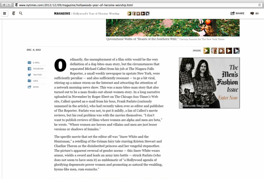
Yesterday, the NYT said it will undergo its first major digital facelift since 2006. The new design follows the current clean Web design aesthetic, with a lack of clutter and large photos. It is a “responsive” design that works on a variety of devices. For now, the ad units on the article pages — which are standard IAB sizes, as well as custom units — will remain the same. But over the course of the year, the Times plans to introduce new units. The publisher has begun with the article page, seeing as most visitors begin there, but it plans to alter its homepage too. A spokesperson said that today, it’s only article pages, and any homepage changes will happen later.
“Internet technology has improved and we didn’t feel the current site expressed our journalism as best we could,” said Rob Larson, vp of search products at the NYT. “From an advertiser perspective, the new design affords all the major ad units we sell.”
The idea behind the site and other similar redesigns at USA Today and The New Republic is to move toward a more visual presentation. That should, in theory, benefit advertiser by providing less to distract the reader. On the NYT’s current article page, the page is littered with the leaderboard up top, as well as tabs to its sections. There’s an email sign up box and another box ad unit on the right rail that gets lost among a most emailed and recommended list.
“It’s a subtle point to make, but what we tried to do is create a cleaner experience,” Larson said. “Certainly, there’s less competing for attention, so everything that remains stands out quite a bit more. There aren’t improvements specifically to the leaderboard, just less competition. The improvements to the overall ad experience are new positions that we approved for our launch later in the year.”
The NYT plans to use feedback from both readers and advertisers in tweaking the design. Larson said the design is part of a larger rethinking of the NYT’s publishing systems. The goal is to have a responsive platform that will have customizations for subscribers. It will do this by rewriting not just its front end but also back-end publishing system.
“It just opens up a range of possibilities which we’ve been locked into and not able to explore over the last few years,” Larson said.
Here’s what the NYT’s article page will look like:
Image via Shutterstock
More in Media

Why some publishers aren’t ready to monetize generative AI chatbots with ads yet
Monetization of generative AI chatbot experiences is slow going. Some publishing execs said they’re not ready to add advertising to these products until they scale or can build a subscription model first.

Media Briefing: Publishers who bet on events and franchises this year are reaping the rewards
Tentpole events and franchises are helping publishers lock in advertising revenue.

With Firefly Image 3, Adobe aims to integrate more AI tools for various apps
New tools let people make images in seconds, create image backgrounds, replacing parts of an image and use reference images to create with AI.


