An offline designer once summed up the state of Web design by comparing it to architecture in Chinese cities. Buildings in China go up so quickly and the pace is so relentless that there are bound to be some real eyesores.
Such is the case on publishing sites. For a variety of reasons — the need to generate as many ad impressions as possible, lack of resources and too many cooks in the kitchen — publishers just can’t seem to get out of their own way when it comes to their sites. Digiday spoke with Kevin Kearney, CEO of design shop Hard Candy Shell, which helped design The New York Observer, New Republic and Wall Street Journal sites, about some of the worst offenders.
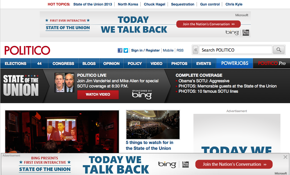
Littered on the top third of the homepage of the political site are four — four! — Bing/Fox News interactive banners and box ads for the State of the Union, including a bottom-of-the-page banner you can X out of. And then when you click on an article, guess what? Four more of the same ads. We cannot escape them.
“If you click on article, it doesn’t seem useful to have the same ad,” Kearney said. “It’s unavoidable. I can see the impact the advertiser was going for, but it seems almost comical.”
The Huffington Post homepage looked like news vomited on the screen. The big chunks — the over-sized headlines — come first followed by a torrent of content that sits in three columns. Clicking on articles can also be aggravating as we wait for the page to load because of the slideshows at the bottom.
“On the one hand, having three equal columns makes it easy to slot in and add more content,” Kearney said. “It’s an attempt to give the feeling there’s a lot of activity, that the site is alive with content and a lot to consume and get through. People scroll on websites, but their attention, after a bit, just blends together when there’s no visual hierarchy. It becomes a lot of noise. Oh, and the ticker at the top? I cant believe people are still doing the ticker.”
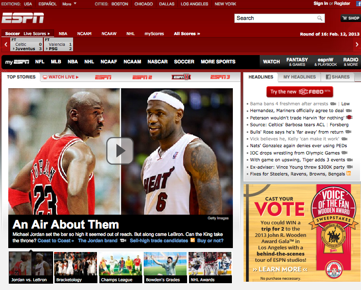
ESPN, Kearney says, is the typical case of a site that’s very successful because of its brand and going all in on digital content early on. “I guarantee this mess is because of a fear of change and a worry to do too much different,” he said. “The site keeps getting worse and worse. They just put all these tiny modules, and they feel like they’re old ads.”
“These carousels? How many times do people need to see stats to get beyond the first one? There are also few links people can get to if they’re not ESPN Insiders. This is a failure in every way. People just hop into the navigation bar to get into a sport to get away from the mess.”
Salon was one of the first online-only magazines. And while the Internet has matured, Salon is, in its own way, still figuring it out. For example, Salon still delivers pop-ups when you click on an article … in 2013.
“What’s weird about this site is, it looks like a bad Vanity Fair site from 1995,” Kearny said. “I don’t know what’s going on with this aesthetic. The layout’s just a reverse chronological blog. It’s one way to go. It’s good for a blog, but for a media company, you have to move beyond that system. There’s so much you can do now. It’s just lazy, that’s what it is. It’s not the worst, and they have way too many share buttons, like everyone else, but at least, there’s a bit of white space and they tried to do a little bit with typeface on their headers. But it couldn’t be more generic.”
Image via Shutterstock
More in Media
Walmart rolls out a self-serve, supplier-driven insights connector
The retail giant paired its insights unit Luminate with Walmart Connect to help suppliers optimize for customer consumption, just in time for the holidays, explained the company’s CRO Seth Dallaire.

Research Briefing: BuzzFeed pivots business to AI media and tech as publishers increase use of AI
In this week’s Digiday+ Research Briefing, we examine BuzzFeed’s plans to pivot the business to an AI-driven tech and media company, how marketers’ use of X and ad spending has dropped dramatically, and how agency executives are fed up with Meta’s ad platform bugs and overcharges, as seen in recent data from Digiday+ Research.

Media Briefing: Q1 is done and publishers’ ad revenue is doing ‘fine’
Despite the hope that 2024 would be a turning point for publishers’ advertising businesses, the first quarter of the year proved to be a mixed bag, according to three publishers.
